
Isabel Sanchís Spring/Summer 2027
The show began as several variations arrived around the same sharply constructed white silk shirt, changing mostly through the skirt beneath it. Beautiful? Yes. Commercially intelligent? Absolutely. The neckline elongated the neck, cleaned the torso, and gave the body an Isabel Sanchís polish in which femininity is enhanced without being cliché. I can imagine it selling very well. Still, for several exits, the collection seemed to be speaking considerably below its eventual volume.
Then it began to wake up.
That progression became enjoyable to watch. The shoes helped. Many carried strange botanical explosions around the foot—somewhere between a flower, a sea organism and fringe—which moved as the models did. Isabel already works heavily with volume, draping and construction, so extending that language downward made sense. They later migrated onto waists and hems, sometimes turning the bottom of a skirt into something approaching floral plumage.
The chandelier earrings were equally maximalist. I heard the person next to me disagree. I don't.
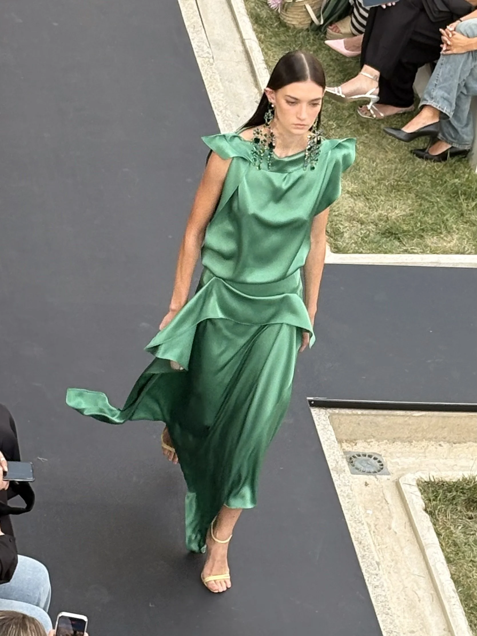
They were heavy, certainly, but heaviness is not automatically excess when the garment can sustain it. An emerald-toned dress accompanied by similarly green stones looked particularly complete. The earrings helped distinguish one look from another without fighting the collection itself.
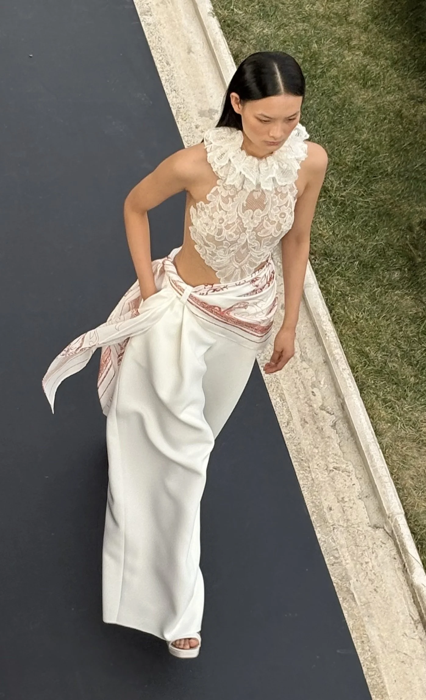
One all-white look came very close to persuading me.
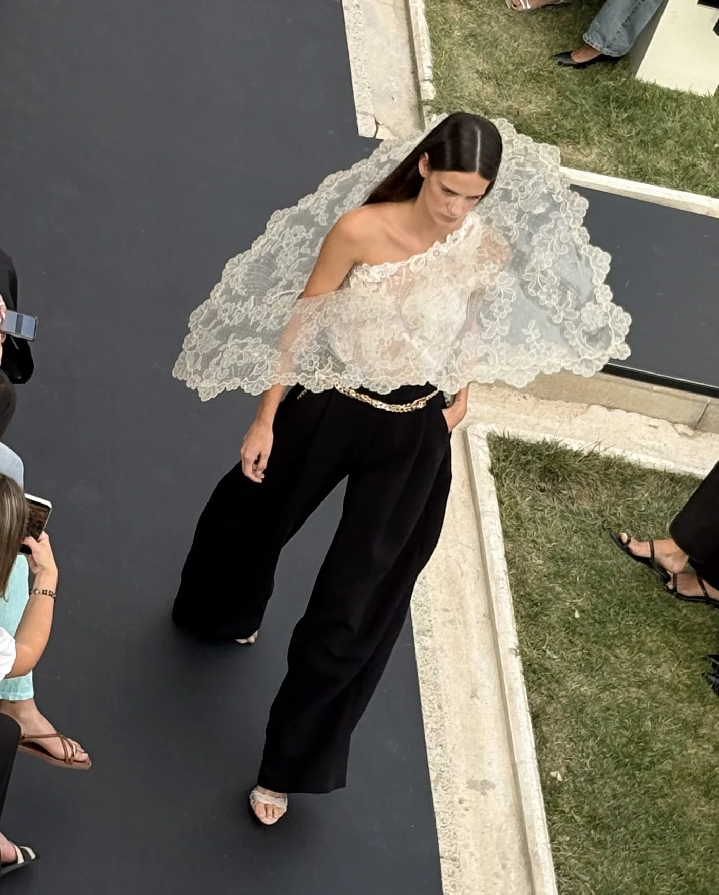
The lace top seemed almost pasted onto the body, leaving the back completely exposed while a ruffled lace collar beautifully framed the neck. Lace is an overused material. Fashion has asked almost everything of it already. Here, it looked surprisingly fresh. Then somebody tied a printed silk scarf around the waist.
No.
The lace already carried its own visual intellect. The print introduced another language unnecessarily. If the scarf absolutely had to exist, white would have been enough. Sophistication is occasionally knowing when the garment has already finished the sentence.
Elsewhere, a celeste gown gathered around the stomach through two pale blush bands knotted near the navel.
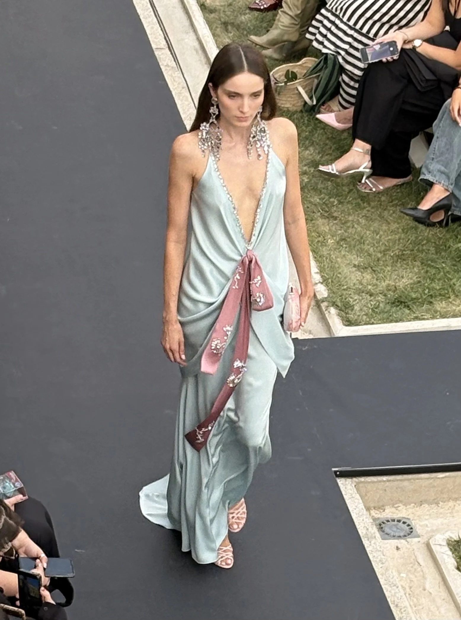
Silver embellishment at the neckline reappeared subtly through the central details, while the earrings contributed to the glimmering effect. The silk traced the body closely enough for the nipples to remain perceptible underneath.
There were several moments like that when the collection drifted towards Gatsby-like territory. Metallic fringe, translucent embroidery, long bows, and movement. For a house whose client comes for weddings, galas, and special occasions in which being noticed is quite literally part of the assignment, that register falls exactly where it should.
Across the room, a pale-blue dress suddenly exploded from the waist downward into those strange feather-flower figures. Standing still, it was good. Walking, it was great. The skirt started breathing.
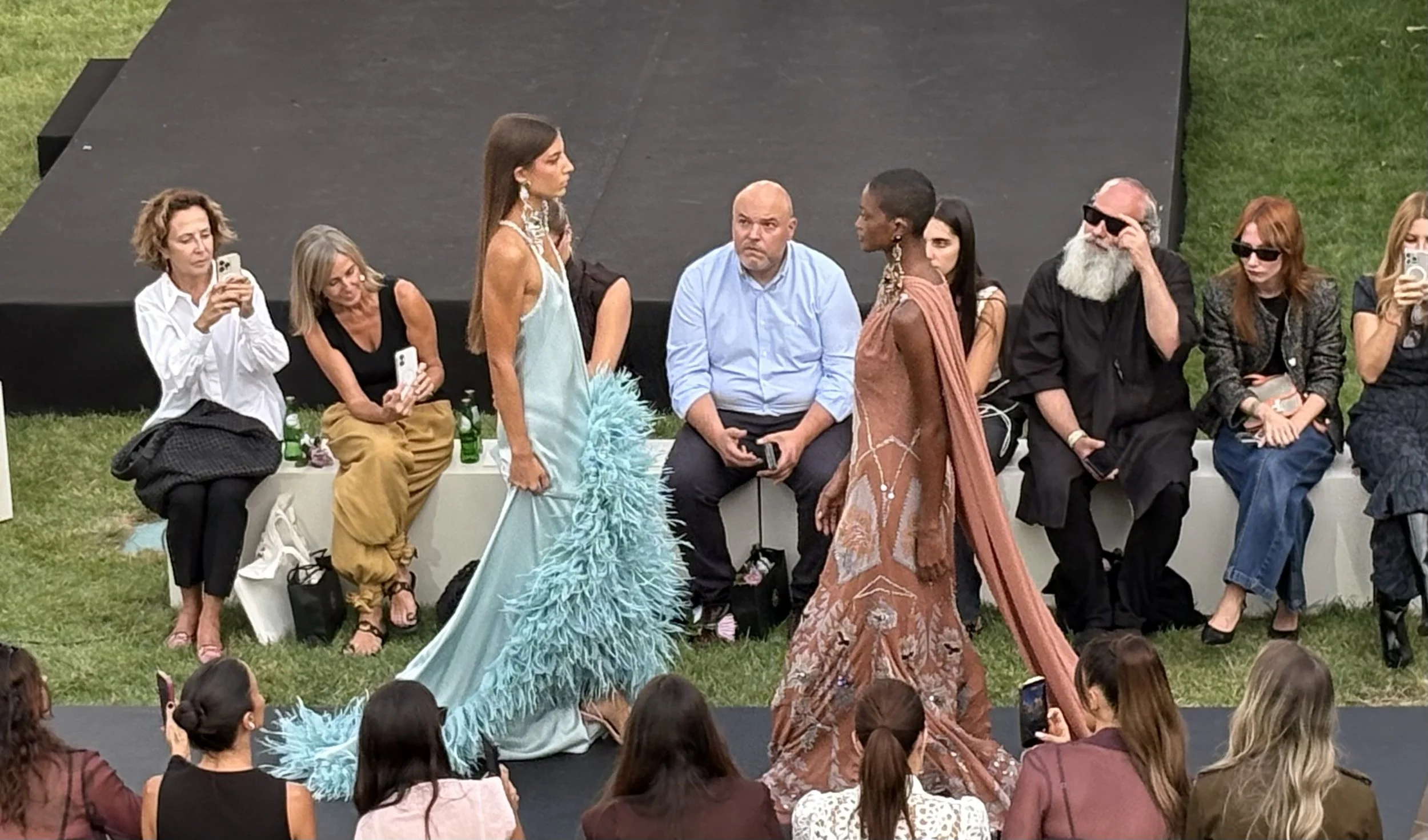
And directly opposite it stood a dark-skinned model in muted terracotta, her dress carrying details close to the blue of the other garment. Skin and fabric almost exchanged palettes: pale skin against blue, brown skin against coral, each colour appearing somewhere in the other woman's look. For several seconds they faced one another, making it one of the show's best compositions.
It later happened again. One model wore a light-blue three-tiered skirt, each hem edged with the same metallic fringe constructing the top above it.
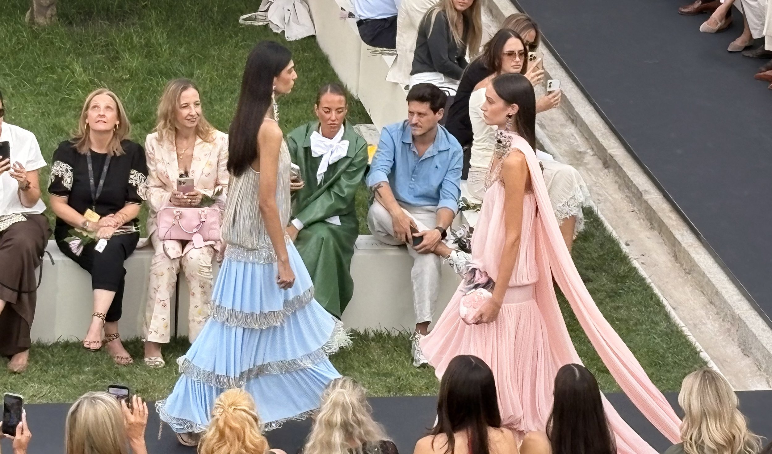
Opposite her, pale pink organza extended backward into a long train. The show’s final platform arrangement eventually made clear that this kind of dialogue was intentional: the models were grouped according to visual families rather than merely lined up for the applause.
A floral dress built through layers of almost weightless fabric gave another kind of volume. I rarely enjoy floral print for floral print's sake, but this felt less graphic than delicate.
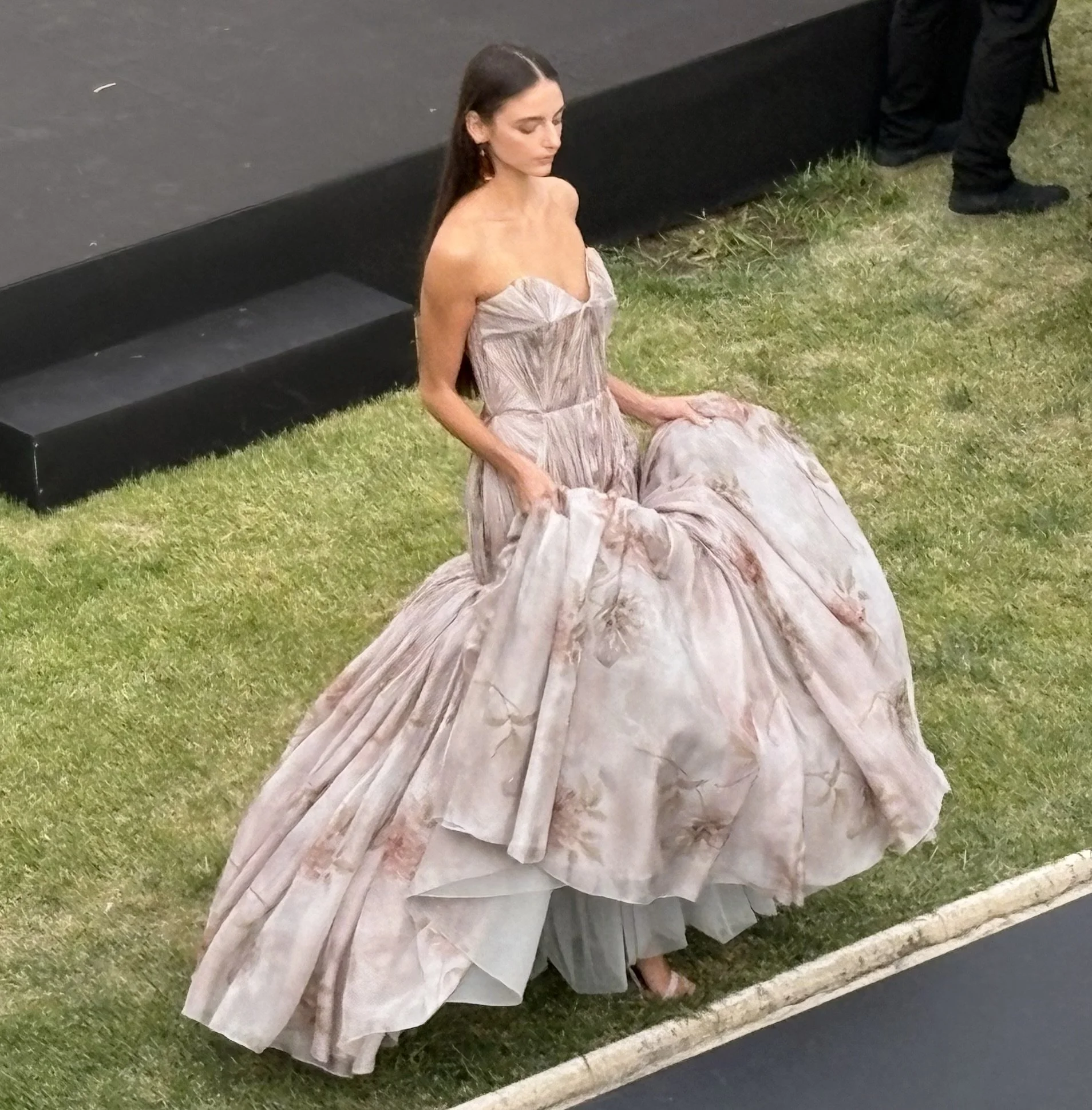
Turn a rose upside down and exaggerate the petals until they become a skirt—that was roughly the effect. The model understood it completely. Collarbone exposed, posture composed, movement controlled. She sold the fantasy without the dress ever having the need to explain itself.
Then the collection became more technological.
That was where it lost me.
The official premise revisits garments historically connected to women's self-expression and liberation, including bloomers and corsetry, with some corset structures reconstructed through 3D printing. In theory, this continuation of the house's technical experimentation makes perfect sense: Fall/Winter 26–27 had already pushed the brand toward illuminated garments, sculptural structures and one of the most technically ambitious collections in its history.
Not everything that is technically demonstrated is visually convincing.
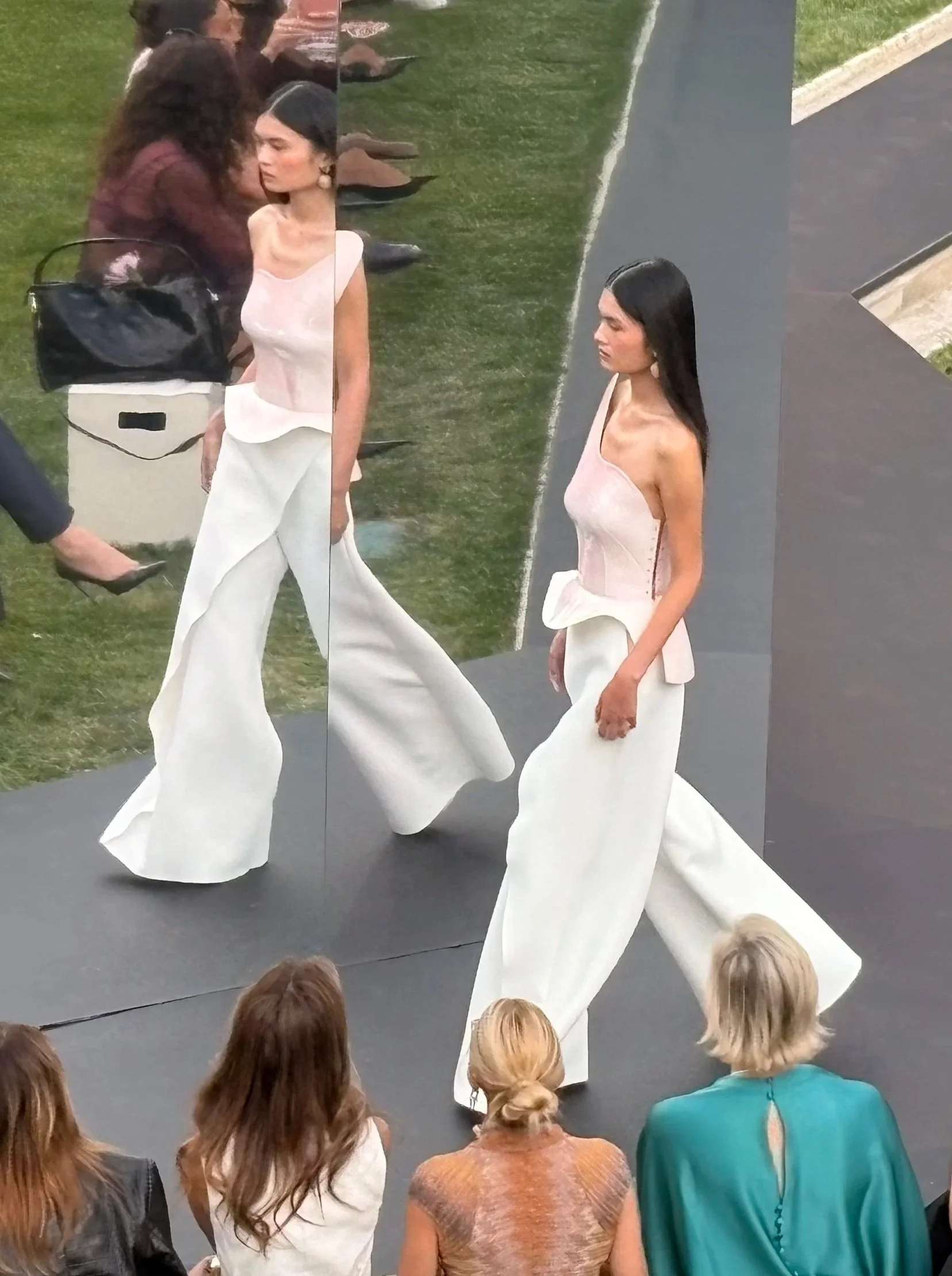
The moulded, body-cast pieces felt too familiar before futuristic. Fashion has been revisiting the breastplate from Yves Saint Laurent and Claude Lalanne's 1969 body casts through Tom Ford and far beyond for decades. Isabel's versions read to me more as runway pieces than desirable ones: technologically ambitious, certainly, but also slightly gimmicky and considerably less elegant than the clothes surrounding them.
The white section solved that problem. Here, that same technical ambition became design rather than trendiness.
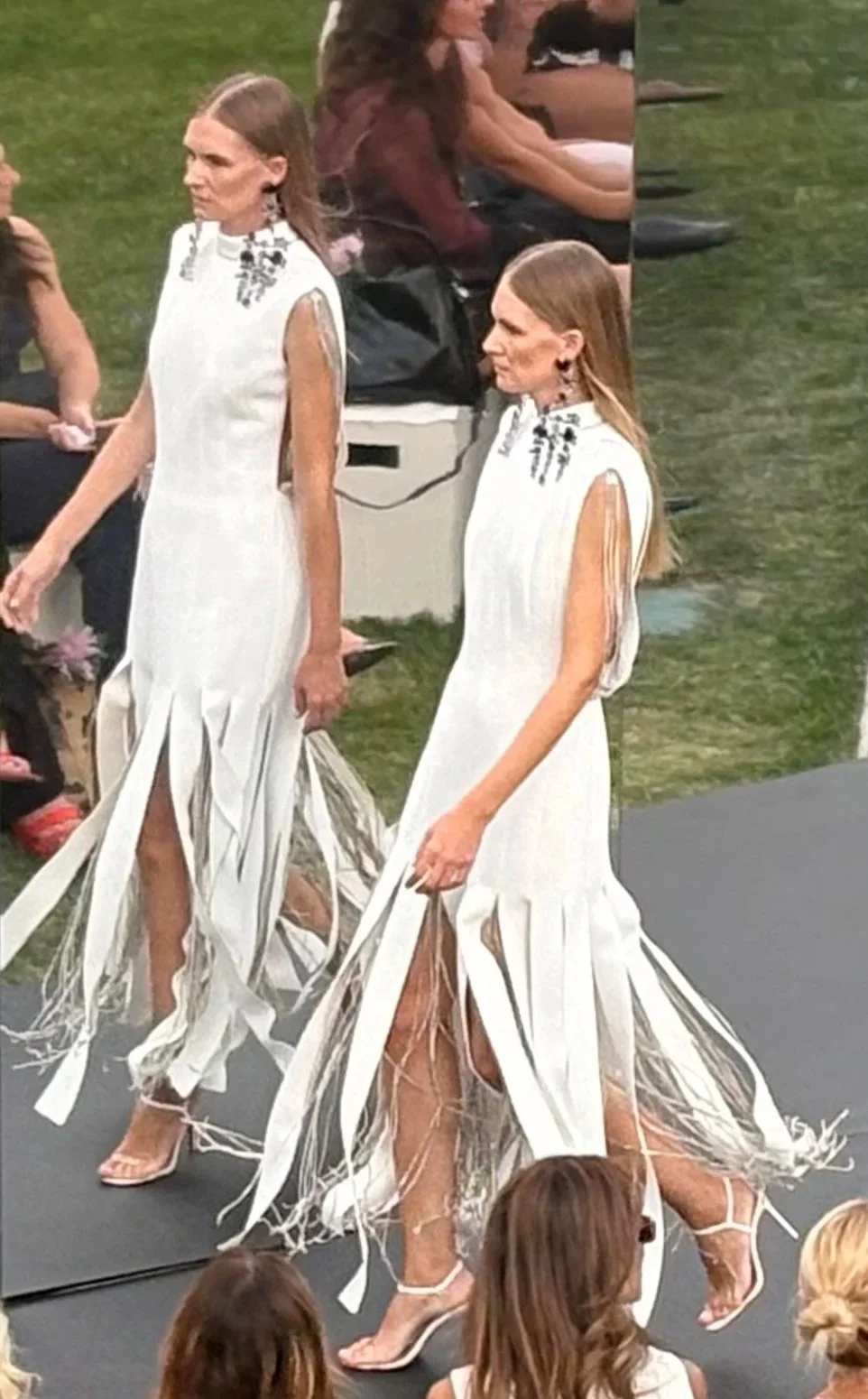
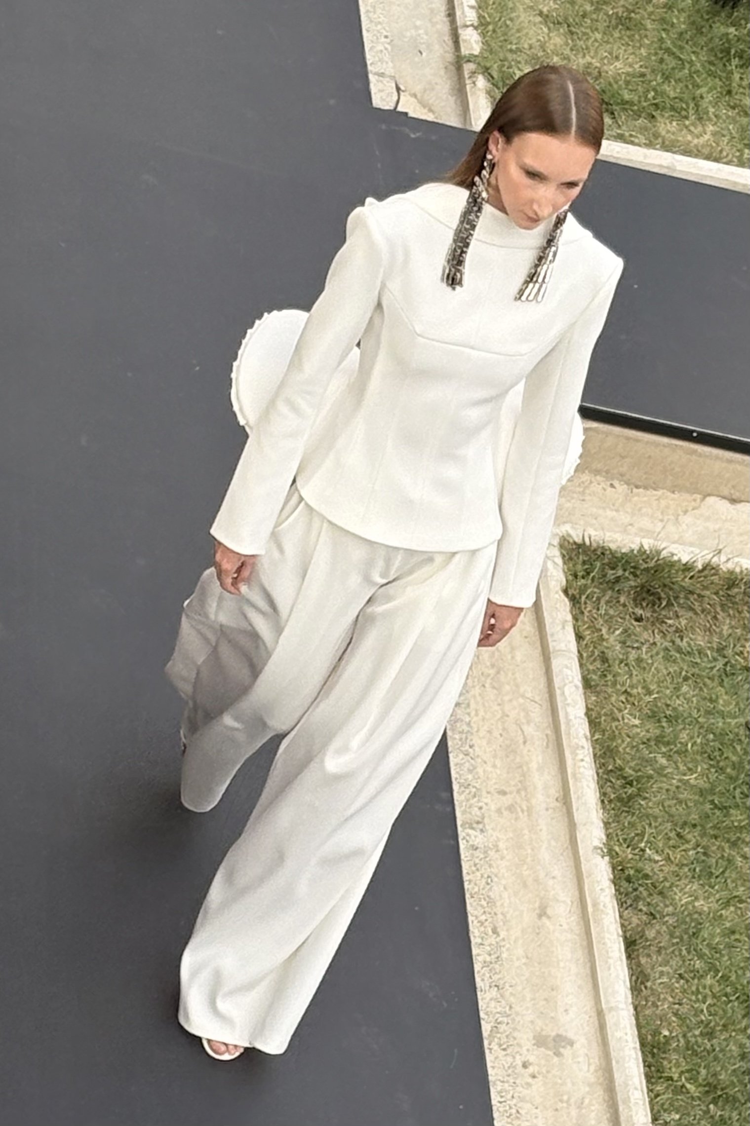
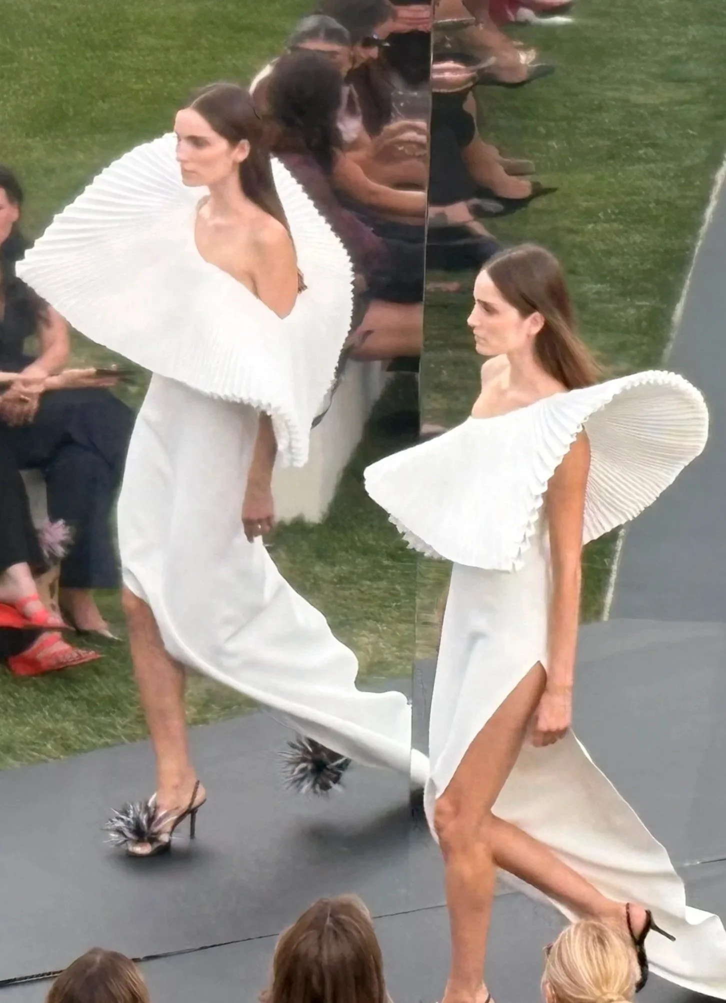
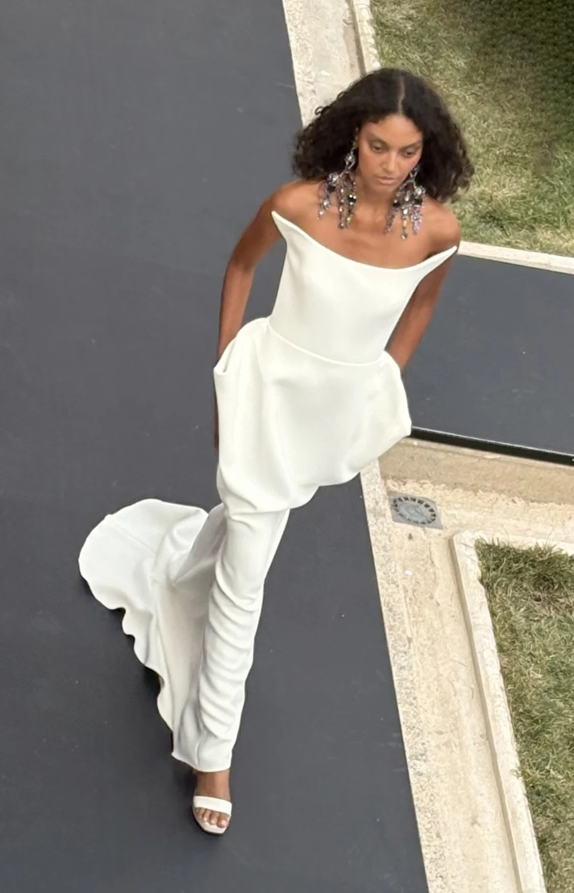
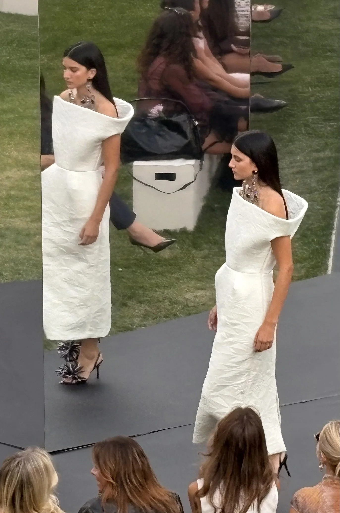
Thick bands of white fringe were interrupted by finer metallic strands. Backs became as considered as fronts. One almost androgynous look carried sculptural volumes emerging from the lower back with enough strangeness to feel contemporary. The entire section looked like its own district in The Hunger Games. Everything was devoid of colour, serious, and strangely futuristic.
The final movement returned to what Isabel does extremely well: dressing women for the moment when the room is expected to look at them twice.
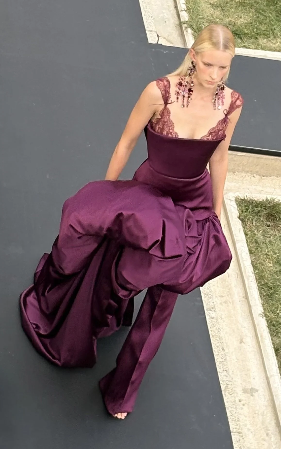
A deep burgundy-violet look was especially accomplished. Silk moved over trousers while lace remained visible around the bust, secured by a small piece of matching fabric. That tiny knot mattered. It made the upper body look sealed, finished—almost like a beautifully wrapped gift. Another black plissé dress needed less.
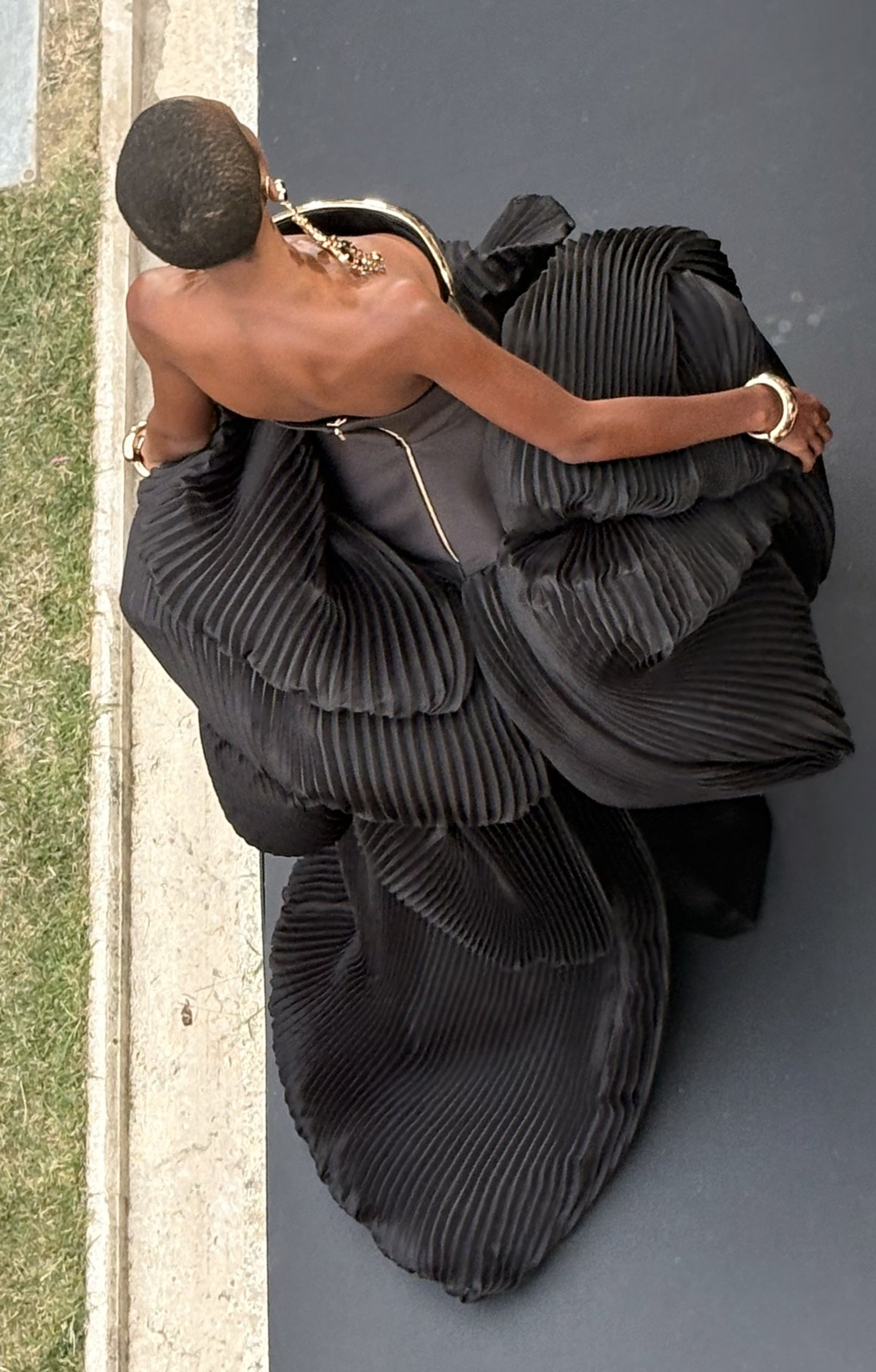
A thick metallic-gold panel through the torso fought against pleating already doing plenty of work. Plissé and metallic shine are both strong textures. They did not need to shout simultaneously.
The soundtrack suffered from a similar problem. Skyfall and Ride understood the clothes. Both carry weight, drama, and a cinematic emotional density worthy of garments this elaborately constructed. Training Season and Nothing Breaks Like a Heart pulled the room somewhere more generic. The issue was not pop music. It was coherence. A soundtrack, like an earring or a hemline, is part of a collection.
Isabel Sanchís and Paula Maiques now operate a house present in more than forty countries, built around precision, volume, embroidery and highly worked occasionwear. At that stage, the runway no longer needs to prove they can make a beautiful dress. Beauty is the bare minimum. The more interesting challenge is keeping beauty from becoming predictable.
Spring/Summer 27 succeeded whenever technique served movement, femininity and presence. The lace that looked newly alive. The celeste silk barely containing the body underneath it. Two women facing one another across colour. A skirt that became infinitely better once it started walking. Those were not technological demonstrations.
They were clothes doing what good clothes should do.
Making the eye stay a little longer.
WRITTEN BY FREDDY ESPINAL
